CSS Grid: The Essential Guide to Creating Flexible Layouts for the Web
Fundamentals Techniques for Building Responsive Designs


Introduction to CSS Grid
CSS Grid is a two-dimensional layout tool for the web that allows you to create rows and columns to structure your web page. It provides a more flexible and easy way to design the layout and placement of elements on a web page in comparison to floats and positioning. The two-dimensional approach here is it leverages both row and column format at once. so in this article, I'm going to cover in detail the working of CSS grid and its different features and how to use them.
Topics in CSS Grid
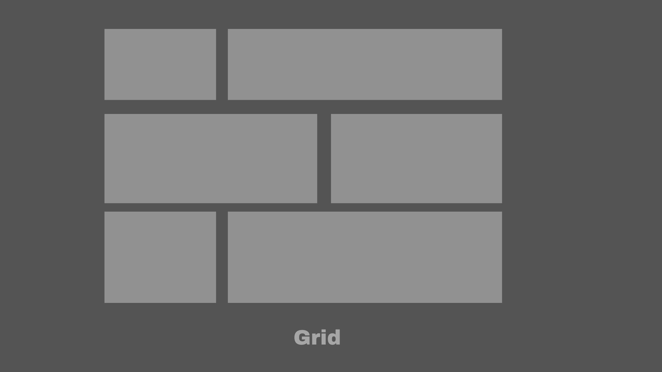
What is Grid?
Grid container
Grid items
Grid template Columns
Repeat() Method
Grid units
Grid template Rows
col-span and row-span
Grid gaps
Grid Lines
What is Grid?
Grid is a layout tool which helps in structuring and designing web page layouts in a two-dimensional format. Grid associates in creating complex layouts efficiently and in a very handy manner. Both main axis and cross axis elements can be placed according to the need. Grid offers many properties which can control elements across the web page. Similar to flexbox, firstly we have to set the display:grid on the grid container by which the items inside the container behave like grid items. A grid you must have seen in your mobile gallery is a perfect example of a grid as it formats the images in two dimensions (horizontal and vertical) .
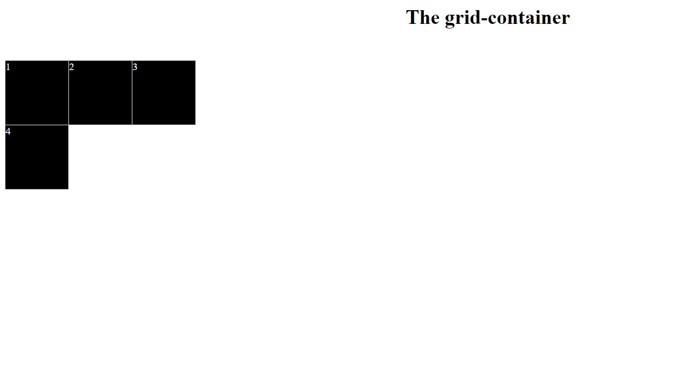
Grid container
Grid container is referred to the element whose display property is set to display:grid , by doing so the element functions like a grid container and various properties can be applied to this element(grid container). Creating an element in a Grid container is first and foremost step to utilise the full potential of the CSS grid. The Grid container lets you allocate its full occupied space in two dimensions(vertically and horizontally). Grid container contains grid items which can be placed in rows and columns to design the desired layout.
<!DOCTYPE html>
<html>
<head>
<style>
.grid-container {
display: grid;
grid-template-columns: 100px 100px 100px;
}
.items{
background-color: #000000;
color: #ffffff;
border: 1px solid #808080 ;
}
</style>
</head>
<body>
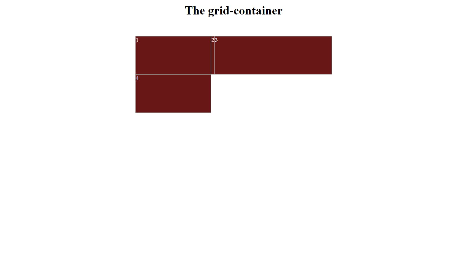
<h1>The grid-container</h1>
<div class="grid-container">
<div class="items" id="item-1">1</div>
<div class="items" id="item-2">2</div>
<div class="items">3</div>
<div class="items">4</div>
</div>
</body>
</html>
In this example, we have defined a grid-container the class that sets the display property to "grid" and defines the number of columns in the grid. The grid has three columns, each with a width of 100px and the rows are not set, meaning that the height will be determined by the content within them. In this example, we have seen a property called grid-template-column next, we are going to cover this also.
Output -
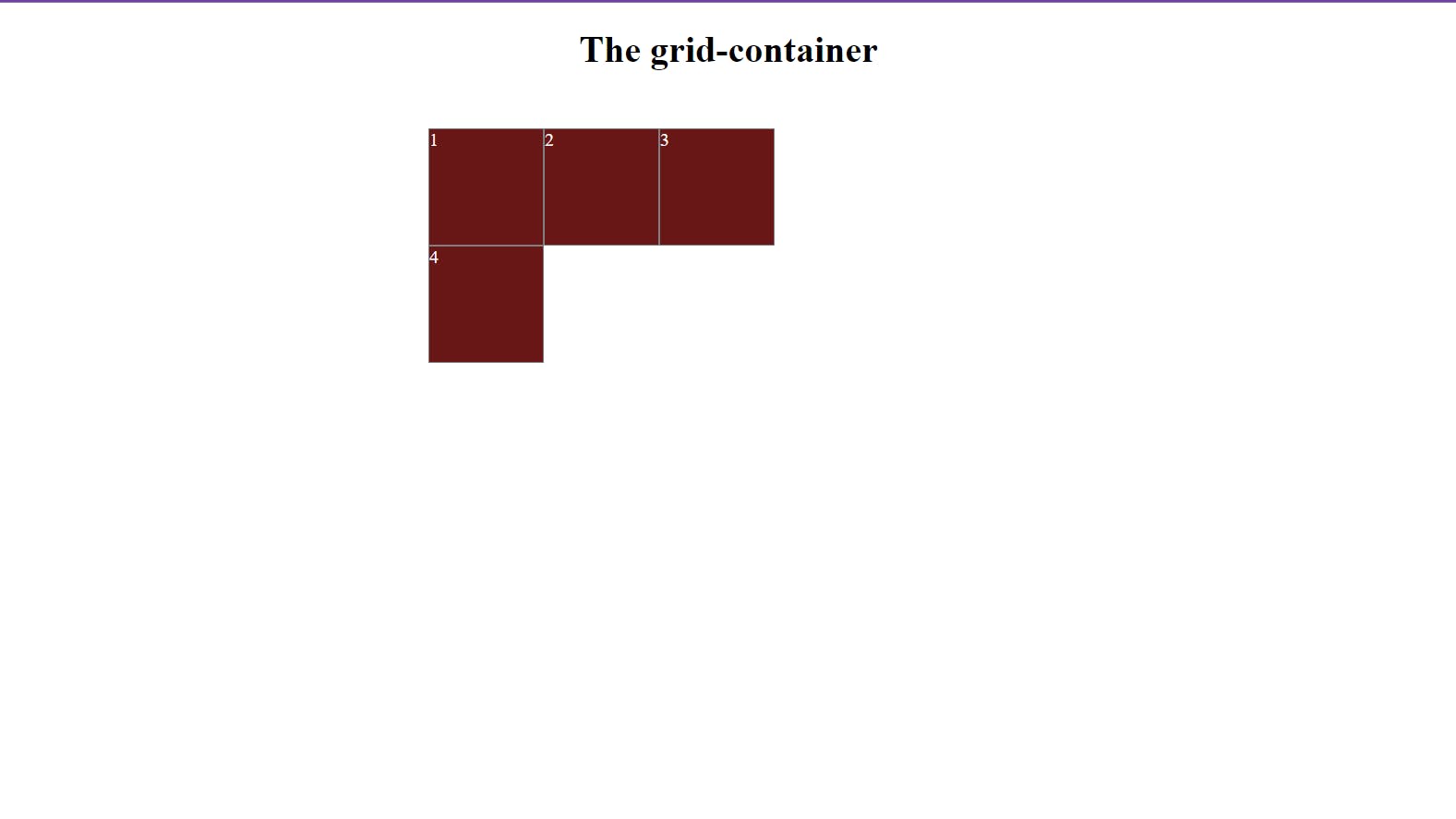
Grid items
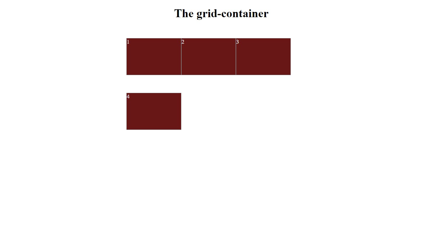
Grid items are the child items that are placed inside the grid container. They are the building blocks of a grid. Each grid item holds some space in the grid container in two dimensions horizontally and vertically and can span the cell in the row and column format. You can define the size of the rows and columns using the grid-template-rows and grid-template-columns properties, respectively.
.grid-container {
  display: grid;
  grid-template-rows: 150px 150px 150px;
  grid-template-columns: 150px 150px 150px;
}
In this above example, a grid-container the class that sets the display property to "grid" and defines the number of columns in the grid. The grid has three columns, each with a width of 150px and the rows are set to 150px.Both grid-template-rows and grid-template-columns properties are defined here.
output -
Grid template columns
grid-template-columns is a grid container property to define the grid layout design . This property declares the number of columns and the width of the column in the grid container. The number of values of this property indicates how many columns will be created in the container, more than one value can be specified at a time which is to be separated with a (,) comma. Possible values are (px,%, auto,fr).
.grid-container {
  display: grid;
  grid-template-columns: 300px auto 1fr;
  padding: 0px 500px;
}
The example code sets the grid to have three columns, with the first column set to 300 pixels, the second column set to auto-sized, and the third column being 1 fraction of the whole width of the web page.
output-
Repeat Method()
The repeat function is useful when you need to create multiple rows and columns of similar sizes in the grid container. So writing redundant code for a similar structure you can use the repeat method. It is a shorthand for defining multiple columns or rows of the same size.
syntax - repeat(<count>,<track-list> )
here count is how many times you want this size to repeat, tracklist denotes a list of sizes for columns and rows for ex(100px auto 1fr) you can provide any size among the three types i.e lengths, percentages, keywords auto and fr.
.grid-container {
  display: grid;
  grid-template-columns: repeat(3, 100px);
}
For example, the above code sets the grid to have three columns, each of which is 100 pixels wide: instead of writing grid-template-columns: 100px 100px 100px; we used the above syntax with the repeat method in it. It is very handy.
output
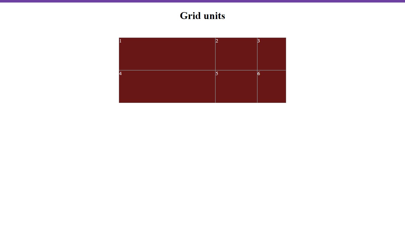
Grid units
Grid units are used to particularly specify the sizing of the row and columns in the grid container. Grid units are of different types, including lengths eg. px, em and percentage values and the keywords auto and fr. these are mostly used grid units.Let's explore each in detail.
px- it stands for pixels it is a standard unit of length, a mostly used unit for specifying the width and height of an element. most of the time u will see the use of pixels in web=development for exheight: 300px;in CSS.%- As we all know this is a symbol of percentage, it is also a measurement unit in CSS and also in grid units as well. used for specifying the width or height of an element in percentage, it occupies according to the whole height and width of a webpage.forex -
50%it will consume the specified 50% of the width or height of the parent element.auto- keyword automatically sizes and placed a grid item based on its content. the auto keyword will allocate the grid item size according to its inner content, not more than that and will be minimal as per the need no extra size will be given.fr- It stands for fraction unit, it is a length unit to allocate available space to grid items in a grid container.fris a fraction of available container space.
.grid-container {
        display: grid;
        grid-template-columns: 300px 25% 2fr;
        grid-template-rows: 1fr 2fr 1fr;
        padding: 0px 500px;
      }
For example, the above code sets the grid to have three columns, every column has different sizes of which the first is 300 pixels wide: the second is 25% and the third is 2fr. In rows, three rows are of similar grid units 1fr 2fr and 1fr . The first and third row will each take up one-fourth of the available space and the second row will take up half of the available space.
output
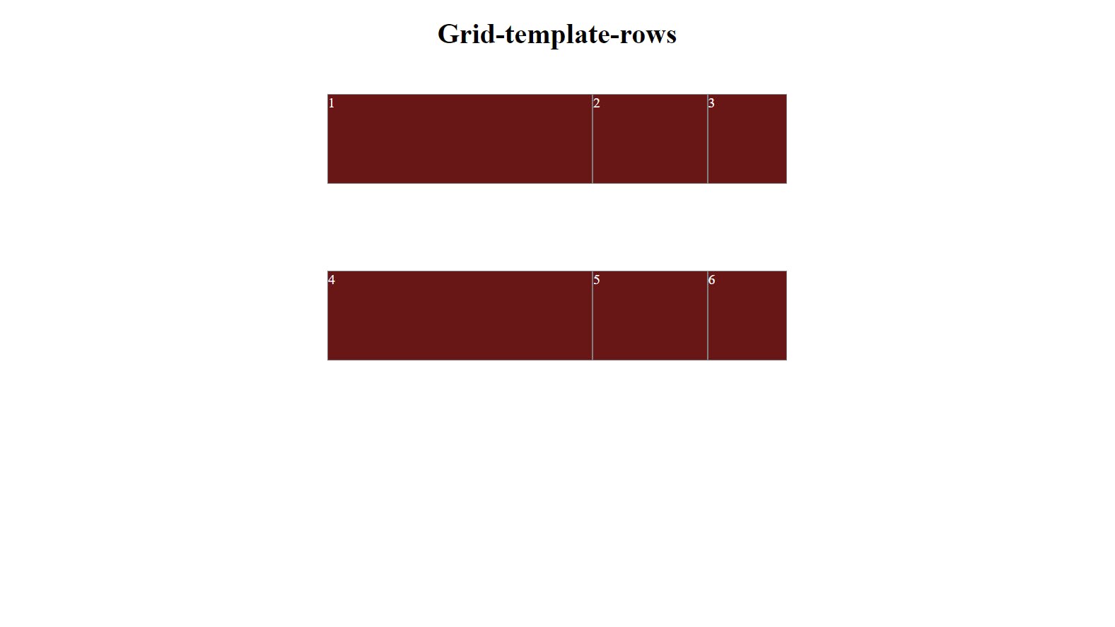
Grid template rows
This property defines the sizes of rows in a grid container. The possible values for grid-template-rows are among the grid units. Besides this, the repeat function also accepts grid units as their values. You can also use the repeat() function to repeat a pattern of sizes for the rows. An important point to note about grid-template-rows is has to be used with the grid-template-columns property to structure the layout of the grid. Together, these properties determine the number and size of the rows and columns in the grid.
 .grid-container {
        display: grid;
        grid-template-columns: 300px 25% 2fr;
        grid-template-rows: 200px 25% 2fr;
        padding: 0px 500px;
      }
output
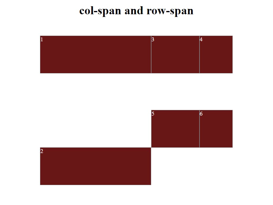
Col-span and Row-span
- Col-span - It refers to the number of columns a grid item will occupy inside the grid container. It is useful to structure and control the width of the grid item by explicitly specifying the number of columns it should be covering. This control can be achieved by the property named
grid-column.one thing to be noted here is, it applies to a single element not to a grid container.
#item-1 {
  grid-column: 1 / span 2; /* Span 2 columns */
}
- row-span - it refers to the number of rows a grid item will occupy inside the grid-container. The height of the grid item can be structured and controlled by explicitly specifying the number of rows it should be covering . This is done by the property named
grid-row, one thing to be noted here is, it applies to a single element not to a container.
#item-2 {
  grid-row: 1 / span 2; /* Span 2 rows */
}
output
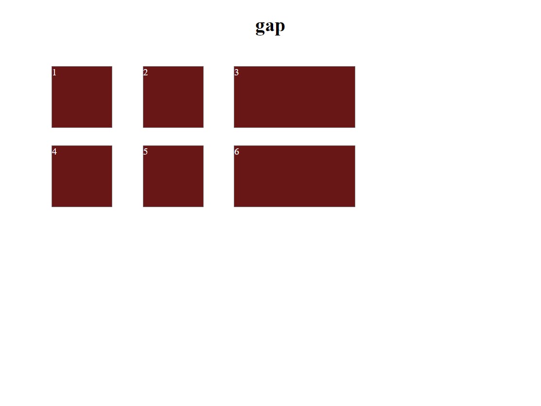
Grid gap
By default, there are no gaps between the rows and columns in a grid.Grid-gap helps create gaps between the rows and columns in the grid.Grid-gap is a shorthand property for grid-row-gap and grid-column-gap .You can also specify separate gaps for the rows and columns using the grid-row-gap and grid-column-gap properties. Possible values are Length, percentage
.grid-container {
        display: grid;
        grid-template-columns: 100px 100px 1fr;
        grid-template-rows:100px 100px 1fr;
        grid-row-gap: 30px; /* Add a 10px gap between the rows */
        grid-column-gap: 50px; /* Add a 20px gap between the columns */
      }
In this example, the grid-row-gap property is used to add a 30px gap between the rows, while the grid-column-gap property is used to add a 50px gap between the columns. This allows you to have more control over the spacing between the rows and columns in the grid.
output
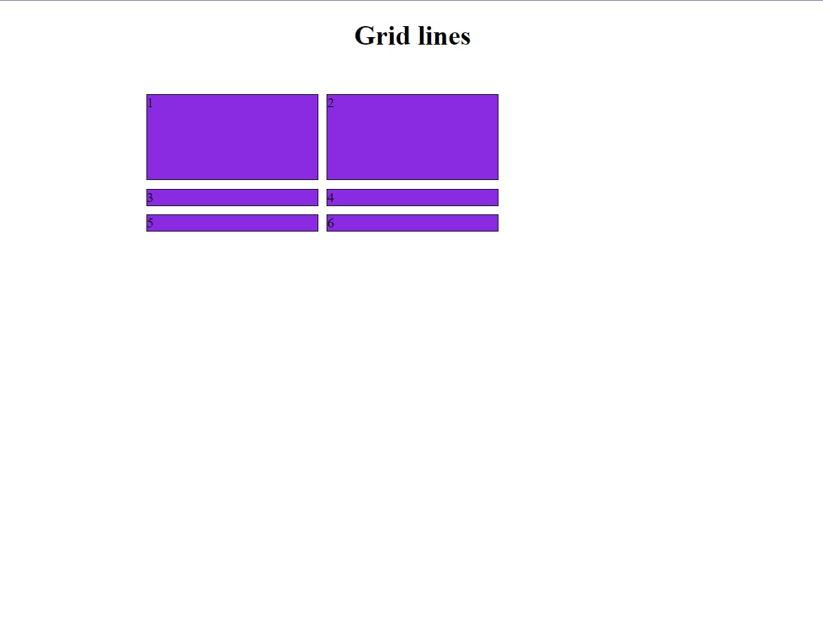
Grid lines
The vertical and horizontal lines that make up the grid and define the columns and rows are grid lines. Determining the placement of grid lines in the grid container is done with the help of grid lines. You can particularly specify the line numbers to position the grid items with properties like grid-row-start and grid-row-end for rows and grid-column-start and grid-column-end for columns to specify the start and end of the grid line.
.grid-container {
  display: grid;
  grid-template-columns: 1fr 1fr;
  grid-template-rows: auto;
  grid-gap: 10px;
}

.item-1 {
  grid-row-start: 1;
  grid-row-end: 2;
  grid-column-start: 1;
  grid-column-end: 2;
}

.item-2 {
  grid-row-start: 1;
  grid-row-end: 2;
  grid-column-start: 2;
  grid-column-end: 3;
}
In this example, the grid-template-columns property defines two columns of equal width (1fr each), and the grid-template-rows property defines a single row of auto height. The grid-gap the property adds a 10-pixel gap between the items. The .item-1 and .item-2 classes specify the starting and ending grid lines for each item, positioning them in the first and second columns, respectively.
output
Conclusion
Overall, CSS Grid for any web designer/developer is a most useful and essential tool to create a complex, modern and responsive layout that leads to a great user experience by the user. Whether you're creating a simple two-column layout or a complex grid system, CSS provides what you need in terms of getting the job well accomplished.
That is all I have got for this article, Thanks for Reading it!!!!